Figuring it out as I go
- Ryan Kroboth
- Sep 28, 2020
- 5 min read
Updated: Oct 13, 2020
This is a guest post by Macabre Motel variant artist Ryan Kroboth. It originally appeared in his newsletter, which you can sign up for here: https://www.ryankroboth.com/signup

This is my variant cover for Frank Martin's upcoming The Macabre Motel one-shot, which will launch on Kickstarter at the beginning of October. I love behind-the-scenes process stuff. So I thought I'd walk you through the creation of this cover. As I'm typing this before I've written the rest, it might be a hefty read. Hopefully it's interesting. After hearing what the other variant artist was doing, I thought I would try do sorta along the same lines (I haven't seen theirs yet). I picked a character from the story, and the twins were who resonated with me. I've wanted to do a design-based cover, and I felt this was a wonderful opportunity. Using the twins as a base, I thought it would be cool to design around a Gemini motif. I did some research online for art and found some neat tattoos.


Many reoccurring images came up. Two girls holding hands facing each other seems to be based off vintage art, and the foundation that many of the Gemini art/tattoos. The second image was much closer to the one I had in my head, which was hippies dancing together.

I liked the idea of one twin being grounded and the other being care-free. Using the good ol' folding paper in half to make a mirrored copy trick, I drew the left twin and then planted the torso in place and used some ballerina references to get a nice dance pose on the other side. Sharing this with my wife, she much preferred the dancer side and said it would look better if they were both the same. I'm a big believer in listening to your constructive feedback.

After it was redrawn, I much agreed with her. And it made me happier using something I illustrated instead of referencing from. Since I've picked up the bargain book of Alphonse Mucha's work, I've been inspired to try something similar to his design. At this stage I knew I wanted to use a border framing the twins, but I also wanted to lean into the motel aspect and perhaps find some old wallpaper design. With so many intended working parts, I knew that I couldn't do a traditional cover like I usually do.

Back to my good friend Google to research vintage wallpapers. There were several really neat designs, but I felt this one reflected what I was doing with the twin motif the most. It had a similar feel.

Using Photoshop and my comic page layout template, I layered together the wallpaper and my scan of the twins. Which required a lot of use of levels and the burn tool to be able to make into an outline with threshold. Damn smudges.

Luckily Clip Studio has a mirror trace option, so I only had to draw one side to get both! Woo! I'm shuddering at the thought of doing this all by hand. I traced the three designs that repeat, then copied and moved around to fill out the page.
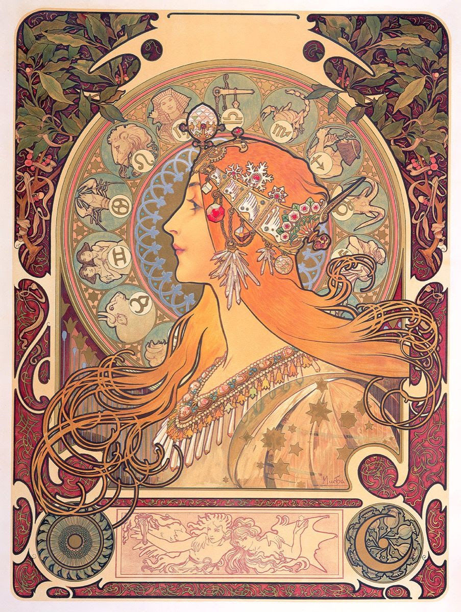

These are the Mucha pieces that ultimately influenced the final design. I won't lie, I totally dropped the first one in to trace the outside borders. I've spent my whole art life looking down on tracing. Between having a deadline, still learning to digitally ink, and this being my first time dipping my toes into art neauvou (thus learning the basics) I gave myself permission. To me, it's about the learning. I wanted to use the box concept of the second image with the designs in it along with "hippie" art. Peace sign, to me, is the first image I think of when I conjure a mental representation of 70s art. On the inside of the box I used some stock photos of flowers from the same art types. Finally, I tied it all together by tracing the original artists motel sign for the title.

I had a vision to get to this point, but I wasn't sure it would actually work! And because I take this stuff so serious, I even hit up Google to look up what leaves are used to cover up nudity in art. Turns out the answer is fig leaf, and I Googled what fig leafs look like. I shared the progress piece with some friends whose opinion I value, and I got some feedback that the size of the wallpaper was too close to the frame. Always share with your friends! I tried shrinking it, but for some reason it wouldn't line back up when I tried to tile it back together. Then someone else said make it bigger and it's was a facepalm moment when I didn't even think to try that. Never said I was smart.

This is one of my first WIP exports after doing the flats/color selection process. I'd rendered the left figure, some of the right and started messing around with psychedelic color scheme in the title bar. I received some great feedback at this stage about color saturation and drawing the eye to it. And it's totally true!
Another thing I wanted to try was to make the wallpaper color tie-die. I played around with it, made a color design. But it ended up being over-powering, even if I did it at opacity. I was gonna share the photo, but I deleted the layer (because the file is 27 layers deep already) and I didn't save any PNGs since I knew it wasn't gonna work. But sometimes you gotta try!

Most of the rest of the cover was working the colors to get a nice contrast and value read. I put a glow at the center because I wanted to get the twins backlit by the lightest value to draw your eye there. Since my tie-die idea didn't work, I was really hoping I could get the mandala idea I had to play out. Above, you see the first pass at that. And the feedback I got was that it was too distracting against the wallpaper. Totally true.

So I shrunk it down, and did it on it's own layer under the glow instead of airbrushing through the glow. It's cool cuz it's barely noticeable. But once you see it then it's a hidden little gem.

For the finishing touch, I wanted to do a white halo around the figures. My plan from the start. I still had the twins inked on their own layer, and I coped that and moved it above the line art. Then I went back into Clip and used that to draw a white halo around the final art. Oh, yea, and this is when I remembered I forgot to sign it. haha Hope you enjoyed the journey through my process of creating this illustration!


Comments